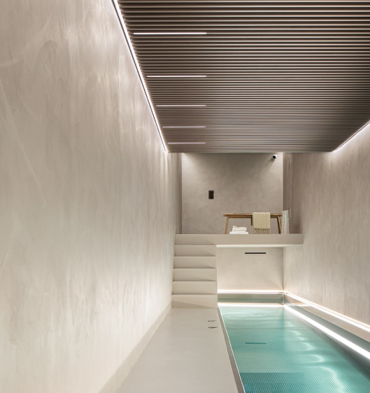
As many of our clients are aware, one of the great benefits of a Sphere8 poured resin floor is the complete flexibility in your choice of colour. We offer a carefully curated range of shades, as well as a unique colour-match service so our clients can have complete control over their final pigment. Whilst this is a great advantage it can be somewhat overwhelming! So we’re looking at the timeless colour combinations you can use to guide your decision…
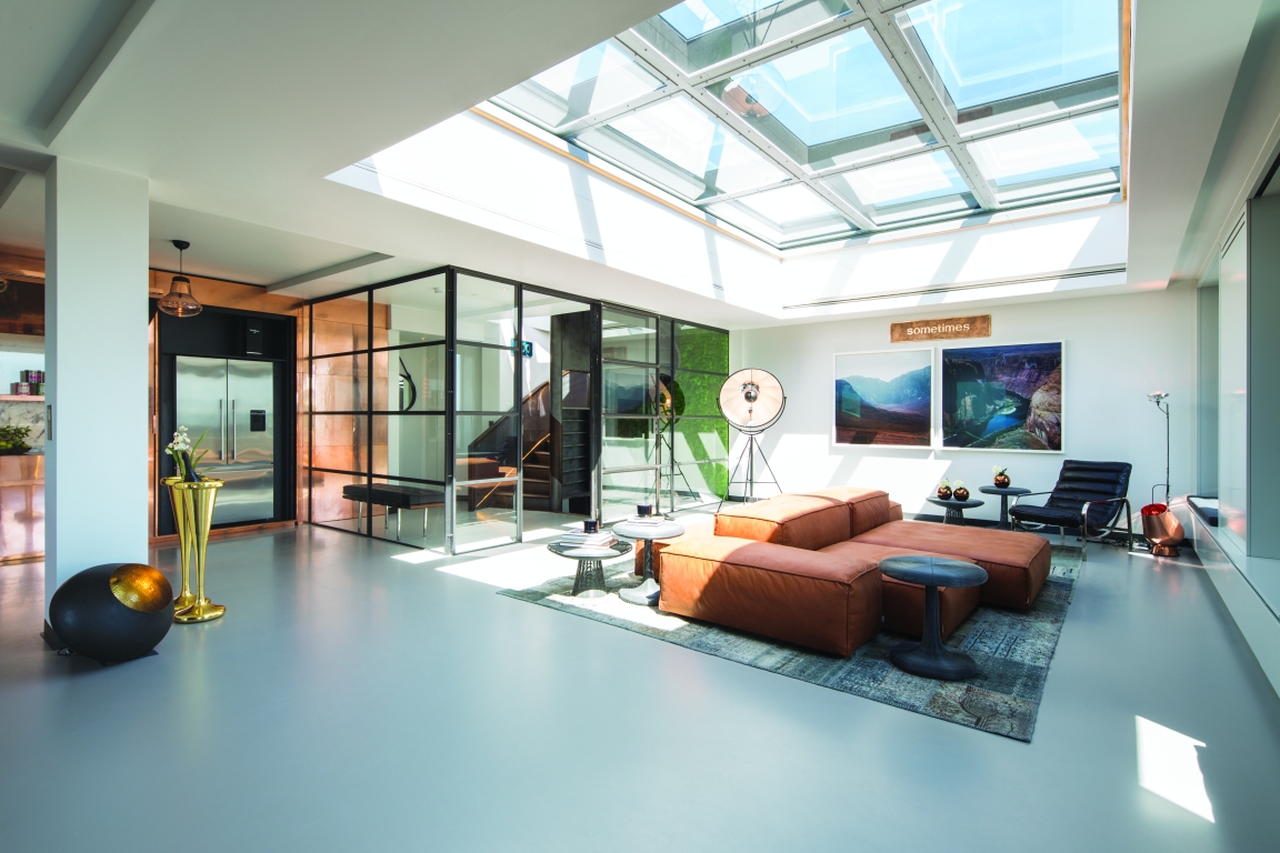
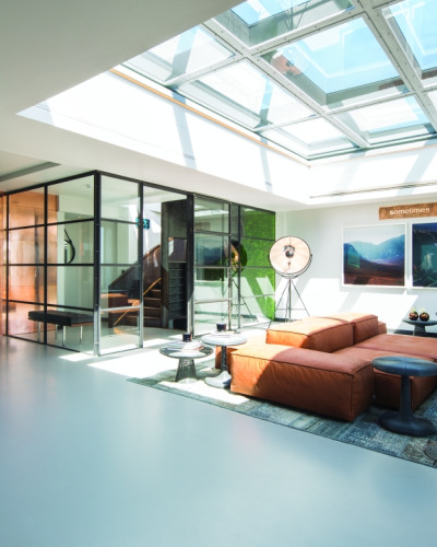
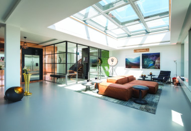
One of our favourite colour schemes is combining the strong warm shades of copper with the perfect contrast and balance of a cool grey. Copper was one of the major interior trends of 2015, but this stylish metal is a classic addition to any interior regardless of changing fashion. One of our most striking projects (and way ahead of the trend in 2014) was this residential penthouse in Central London, which featured a standout fitted kitchen in copper – including a full-wall installation and futuristic breakfast bar/kitchen island. It was truly breath-taking, and brought the room to life. This was then perfectly echoed by the tan leather sofa in the middle of the open-plan space. The client wanted a neutral canvas for the rest of the interior that would complement the copper kitchen units without competing with this colour scheme.
The walls were just white, so it seemed obvious that another colour would be necessary to introduce in the mix. Cool grey was the natural balancing act for such a warm and bright shade. In some lights this is an almost greeny blue, creating a dramatic contrast of colour. However in softer light it is warm and neutral – allowing beautiful lighting fixtures, furniture and accessories to stand out in copper. A vintage rug in a pattern of blues, greys and browns unites this palette in one feature – bringing the colour scheme together without making it seem contrived. We love how the floors bring the contrasting and complementary colour in this interior, rather than the obvious choice of a different wall colour.
© Sphere8, 2022
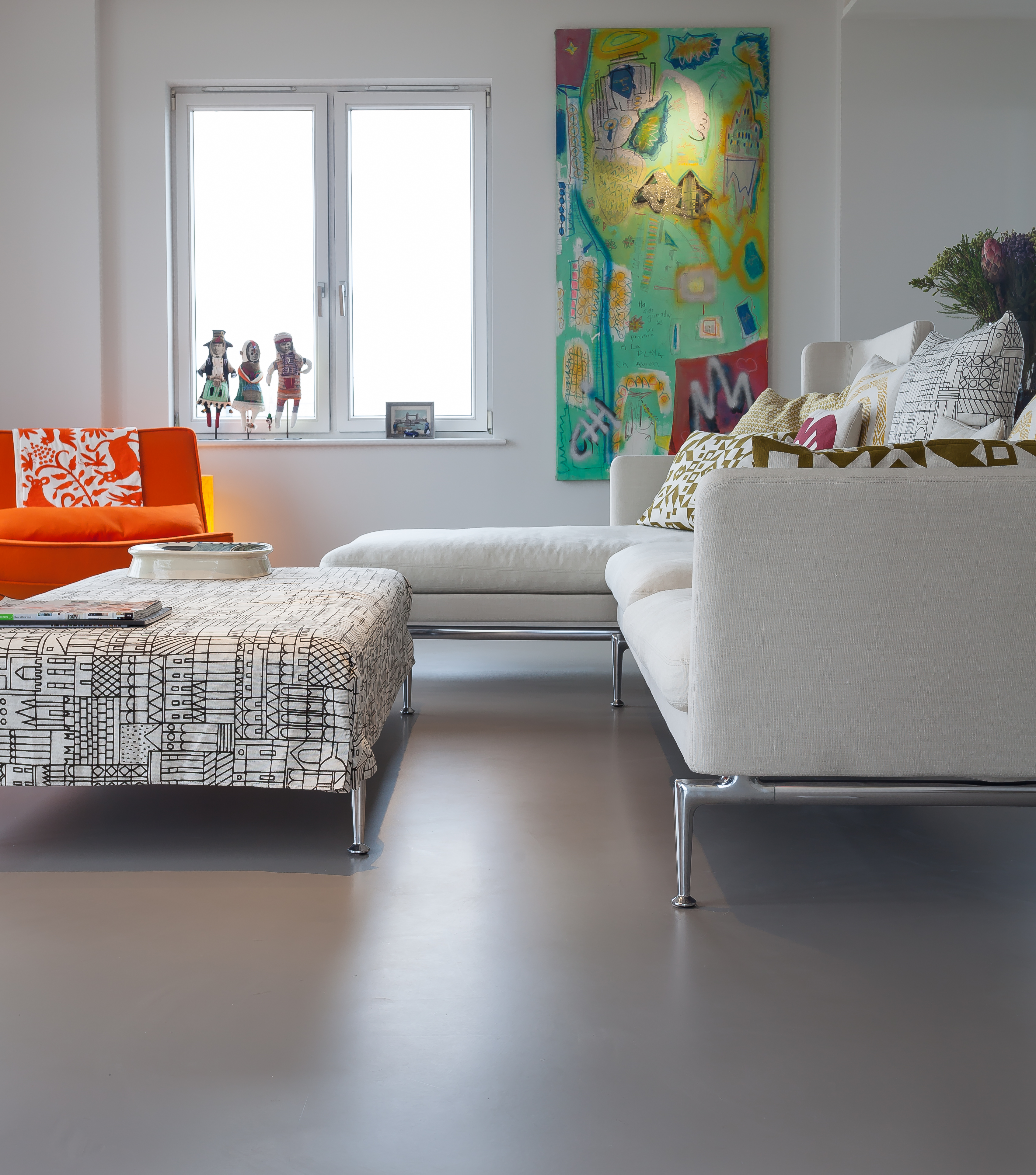
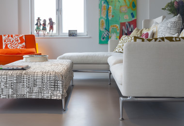
In some cases the colour scheme is less obvious or clear-cut. You can find inspiration for your colour combinations from almost any source, but items you already own make for a realistic interior plan. Our client based in East London on a Thames-side development chose to do just that – using their existing palette of dynamic modern art to guide their interior style.
Given they had strong colours in mind, we used an equally strong flooring colour in their stylish flat. However, we were also aware that the amount of light flooding this incredible development had the potentially to make the space cold – without traditional architecture to ground and warm the interior. The client settled on Motion Flint – one of our natural greys that has hints of green and brown running through it. This warm shade is dark and strong enough to balance the vibrant artwork and pops of colour throughout their contemporary furniture, but still works with a variety of colours and unites the whole space. Combined with softer grey walls this floor colour creates a strong but neutral blank canvas for an ever-evolving collection of colourful furniture and artwork.
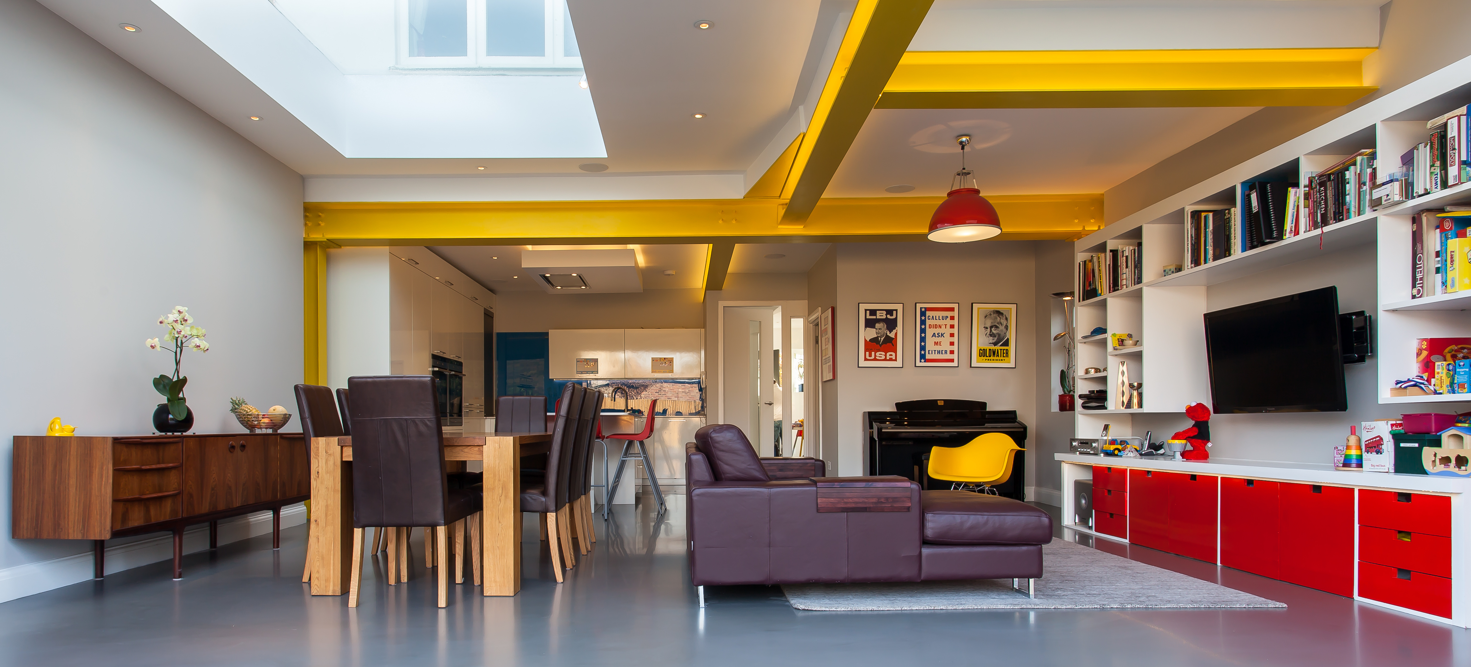
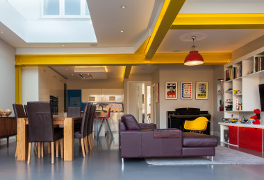
The same principle was applied in a very different residential project in North London with completely different effect. This space was a multi-purpose family room – uniting living, eating and cooking spaces with one colourful interior. The colour scheme here emphasised the child-friendly family environment they were trying to create, with a palette of primary colours – including a bright blue kitchen splash-back, red bar stools and TV units and metai beams painted a vibrant yellow.
Our clients chose a Motion Slate floor – the darkest of our Natural Greys, which perfectly balances the strength of colour elsewhere. One of the classic ‘rules’ in creating a multi-coloured palette is to match the strength of colours – brights and pastels are much trickier to match than two bright colours might be. Our clients followed this theory perfectly in this space – balancing three strong accent colours with a dark brown sofa and chairs and the warm brown-grey of the floor. Strong but streamlined furniture enhances this practical but stylish finish – the overall effect is one of both utility and whimsy. Our Motion Slate floor looks particularly brilliant with the yellow accents, as it has a redish almost purple base – being directly opposed to yellow on the colour wheel, this explains why the two colours pop when put together.
© Sphere8, 2022
© Sphere8, 2022
|
Office and Design Studio Unit 1, Five Eastfields Avenue London SW18 1FU |
|
| 020 8969 0183 |